Pictorial Representation of Data for Smart Decision-Making
07. 09. 2018
To help us better understand a large amount of data, there are a wide range of visual tools available that collect data in the desired form and time frame. These tools ensure that we always have information available that directs us to where action is needed.
Looking for opportunities to reduce costs and improve the efficiency of a company’s operation is a never-ending process. In order to be able to focus on measures to improve our future activities, we need “real” data – presented in an appropriate and understandable way, so that we do not have to study complex data tables unless it is absolutely necessary.
What can we do if the logistics report is outdated?
There are diverse tools and software for data processing available on the market. Their providers endeavour to make the best visual data reports available to us, the users. However, as users’ needs differ – from the format of the report to the time when it is required – it is sometimes difficult to fulfil these needs. Have you ever held in your hands an important report on your logistics operations and found it obsolete and inadequate? And have you also found that the costs are too high and the time required for the adaptation of new reports too long?
Connecting different systems brings a competitive advantage
The solution is in connecting different IT systems and tools in collaborative software. We enable clients who have implemented Atlas WMS to connect with the visualisation and analysis tools of their choice. With their help they can better tap the potential of the large amounts of data processed and stored by Atlas WMS .
A picture shows more than 999 words
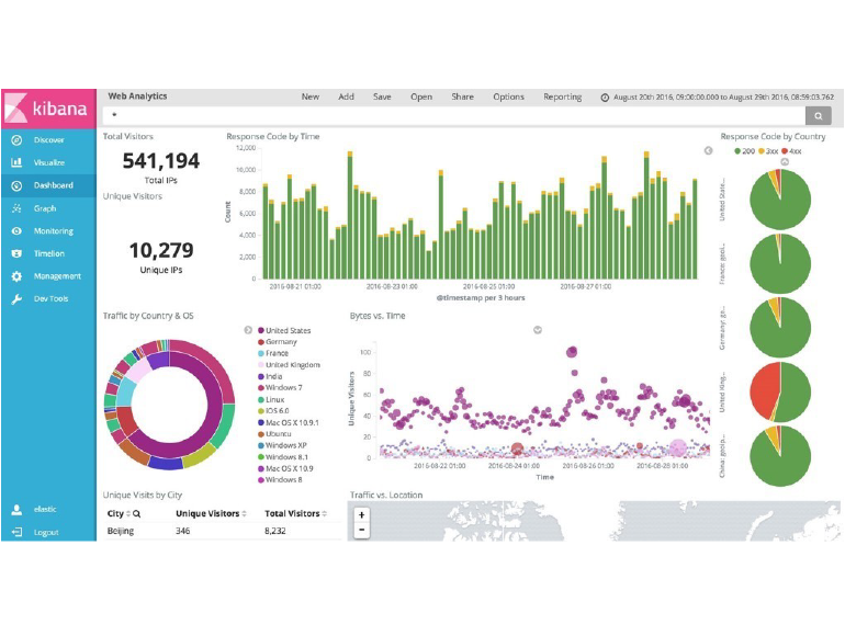
Kibana is a good example of such a tool. This open-source visualisation and research platform by the company Elastic is designed specifically for processing large amounts of streaming data as well as data in real time. Atlas WMS provides all of the data and links them to Kibana, which processes them in a user-friendly form. Kibana includes tools for the easy generation of reports in which data is presented in different ways – by adjusting colours and with highlighted search results.
Immediate insight into your data
The combination of data from Atlas WMS and the selected visualisation and analysis tool provides an immediate and independent insight into solutions for streamlining your operation. Entirely independently. Anywhere. With a single click.
Among other things, would you like to have the following information at your fingertips:
- How many palettes have been loaded into individual trucks today, yesterday, this month, this year, last year, etc.?
- Which final customers usually have their allocated material in particular zones of the warehouse?
- Which users correct stock information most often?
- Which users are the most productive and at which hours of the day?
- How many kilograms of material go to which clients daily?
- How many packages of a certain type are made per day?
- Which parts of the warehouse are most burdened in terms of the number of picks, material weight, etc.?
- Which forklift drivers make the most movements and at which times of the day/week?
- Which warehouse picker has the most picks?
Answers that are appropriately structured to present the information you need are provided by connecting Atlas WMS and the selected visualisation and analysis system.
Example 2:
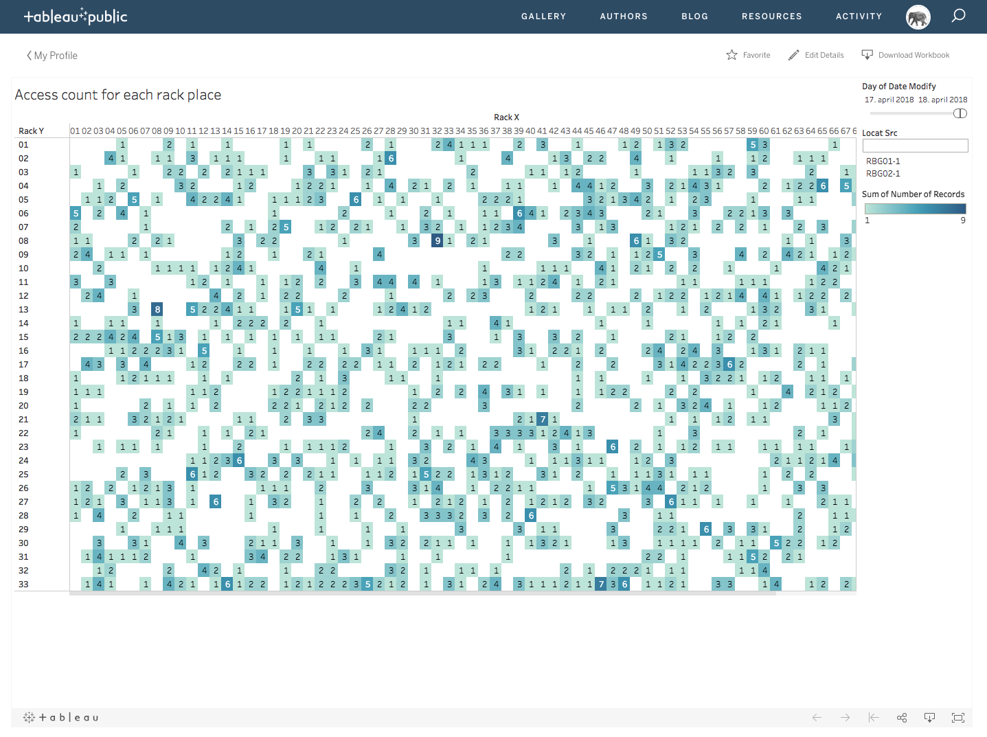
Another such tool is Tableau, which boasts fast and simple visualisation and strong analytics, with an option to simply connect different sets of data for common representation/display or analysis.
Would you like to find out more?
For additional information call our sales department, T: +386 1 583 8017, or send an email: Epilogʼs sales department!