Ready for the Future: Updated Epilog and Atlas Brands
10. 12. 2018
We are connecting, upgrading and innovating for you. We have already made a step towards the future in the visual identity of the brands Epilog and Atlas.
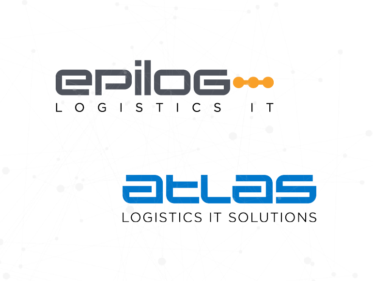
Epilog's logo used to be designed to represent the essential foundation of our company's operation and the development of IT solutions. The latter was illustrated in the logo by emphasised horizontals. The three dots after the name indicated that with us the story of successful informatisation of logistics has only just begun. Atlas – a Titan that supports every event in a warehouse, while at the same time offering all of the necessary data support to ERP systems – was designed with strongly highlighted verticals.
But changing processes and management arrangements, industry 4.0, robotisation, etc., are bringing rapid changes and new challenges to logistics. At Epilog, we pay close attention to these requirements, as well. Our expertise, capabilities and offer are therefore constantly upgraded and expanded to the areas dictated by the needs of our clients, so that they can remain competitive in the challenging market of today.
We have been aware for a long time that Atlas is much more than a mere warehouse management system. It has expanded into a tool for bringing production process management, planning, and the connection and coordination of human and machine resources into a unified system; it even enables goods tracking outside the warehouse. The Atlas brand has become a name for a family of products that can operate either individually or in a mutually coordinated way within a logistics system.
Expansion and the culture of constant change have prompted us to update the visual identity of both our company and our main brand, Atlas. In so doing, we are seeking to capture what we do in our company in terms of design, as well. The updated design of both logos reflects harmonisation and power, while Epilog's three connected dots reflect the connection of diverse areas.
Our colour identity remains the same. Grey, illustrating maturity, and orange, illustrating both the youthful dynamism required by the rapid development of logistics and technologies, and the spirit of our team. Atlas's blue colour reflects expertise, intelligent design and reliability.
In our new clothes we continue to be ready for any future logistics challenges.

Updated Epilog and Atlas Brands
